The Design Process: Prism
 |
Since I needed to talk about fabric choices for the Prism Along, I thought I would take the opportunity to share with you a little bit about my design process and fabric picking methodology. Just as a reminder for when I reference the different parts, this is Faith's quilt:
I don't have a set in stone "this is how I always work" method, but it almost always involve sketching up the quilt ahead of time. I use Adobe Illustrator to sketch up all my quilts, and try out tons of color combos before settling on one. Other options include EQ, the new tool by Threadbias, or just plan old pen and paper. (If you are making the Prism quilt, you can lay tracing paper over page 5 of the pattern to sketch up a thumbnail of the quilt!)
When I originally decided I wanted to make this quilt, I looked at the pattern and realized that if I used white for the gray diamonds, I could actually use a jelly roll to just squeak by with enough fabric for the middle white strips and the tiny diamonds. Since I fell in love with Joel Dewberry's fabric line Notting Hill, I thought I might use that. So, without doing any sketching of the sort, I ordered two jelly rolls. You know, be prepared :).
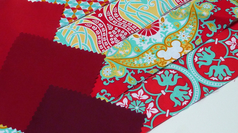
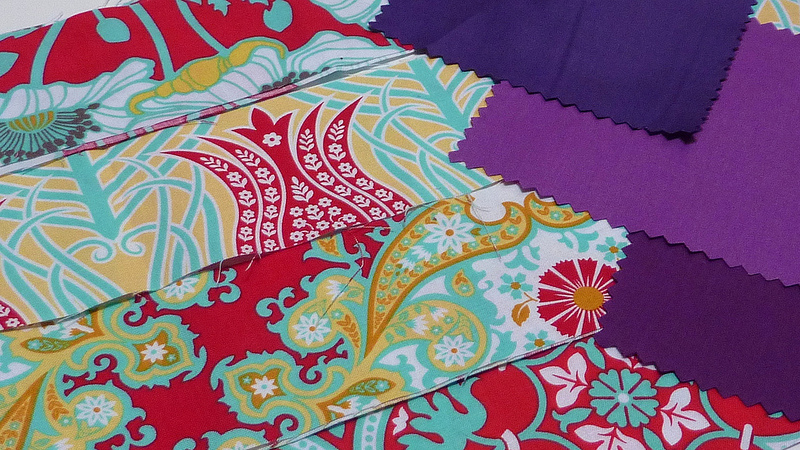
 Isn't the fabric beautiful? You can find Notting Hill at Knotted Thread. But the more I looked at it, the more I thought the Prism design and the girlier color ways I chose didn't really fit well together. So I fiddled around and pulled out just a few of the red fabrics for the tiny diamonds and started playing with some solids to be the gray diamonds.
Originally I was thinking some really deep reds to create an intense color palette. Loved it! But thought I should keep playing.
Aquas could pull out the blue tones in the Dewberry fabrics. But they aren't strong enough next to those bold reds.
Just on a whim, I pulled out some grays. These could work as well! Unfortunately, I seem to not have the best selection of gray charms at my house, but I can still see this working well.
And when I was digging through my Michael Miller sample charms, I thought the purples looked just divine. They look so rich next to the reds!
So my next step was to create a digital sketch to see if I would like how it was going to look. So I sketched up the quilt and colored away.
But of course, I had to fiddle around with some more colors. You know, for your sake. That backfired, because now I can't make up my mind!!
Here's a sketch of my original idea, using the pink colorway for the middle "stripes" and the blue/green colorway for the tiny diamonds. I think it actually might work really well. The larger amount of white space creates an airy enough feel for these more feminine prints. I might actually use this...
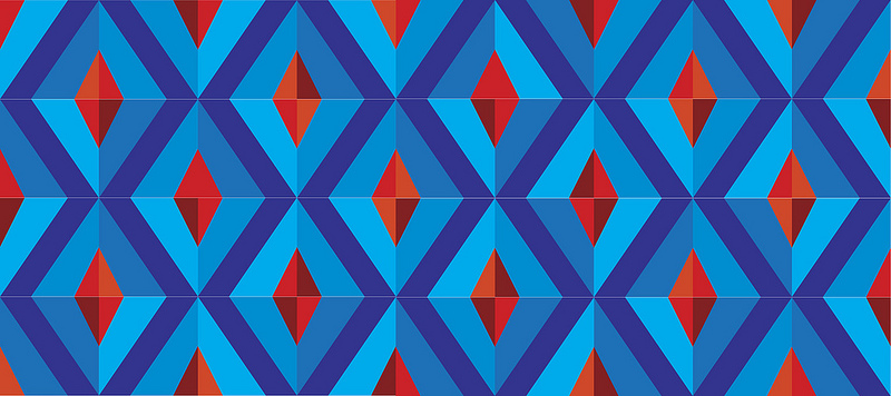
Then I thought I might try out a complementary color scheme. It's not my favorite. I do prefer when part of the design is white, but that's just my personal preference. It might look better as an analogous quilt...
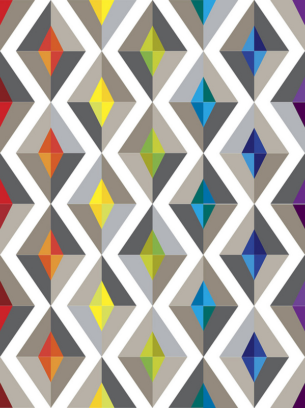
Of course I thought it would be fun to try out a rainbow pattern for all you rainbow people out there! I like this one a lot, it's really fun. Rainbow patterns are really great for using up your scraps. This would be great with scrappy prints and gray solids. You could also make a really fun version by using these bundles from Fabric Fly of colorful gingham or polka dot fabric for the diamonds. (Don't forget, you can get 10% off Fabric Fly with the code "QuiltAlong10" until the end of June.)
But I decided to add a little twist....more negative space, anyone? This would look fantastic in some edgier fabric, like a pile of Michael Miller Mirror Ball Dots. There are also a few gray Mirror Ball fabrics, so you could go metallic all the way!! (You can find Mirror Ball Dots at Knotted Thread and Fat Quarter Shop.)
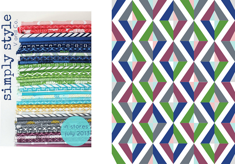
Another interesting way of looking at this quilt would be approaching it mainly with value - user darker values for the gray diamonds and lighter values for the tiny ones (or vice versa) without overly limiting your color palette. This certainly isn't my strength, but here's a sketch with some of the Simply Style line by V & Co:
You can find this lovely bundle at I Don't Do Dishes.
I asked my husband for his opinion. He was asleep on the couch, glanced over, and said something about "a 2 color quilt". This is an interesting version as well, though I'm sure whatever he had in mind would have been cooler. He thinks of some really interesting ways to color quilts, so I'm a bit sad he was asleep. Granted, it was midnight....
But naturally, a two color quilt made me think of yellow, because I really want to make a yellow and white quilt. What haven't I tried before? Ah ha, coloring the middle diamonds gray. Let's see what that's like.
Well shoot. Now I want to do that one. Shot cotton grays, perhaps? With a pile of yellow solids.
But I already purchased the Joel Dewberry fabric....
Hmmm....
Two quilts?
But anyway. Now you can see a bit of my process. Hopefully it was interesting, and helped you think a little bit more about the large number of ways you could interpret the Prism quilt - or really, any quilt!
My advice is to always try coloring a lot of different options ahead of time. Think outside of the box. Ask a non-quilter for their advice, or just someone with a completely different color sense to see if it takes you somewhere new and interesting. You can also read Jess' interview for more suggestions on picking fabric for paper piecing patterns in general, and Faith's interview for some really good ideas she had on options specifically for this quilt.
So if anyone has an opinion on what version I should do, let me know!
This post is part of the Prism Along series. All of the posts can be found here.
